IBM Design Language
How do you make 1,000+ designers consistent without taking away their choices?
The fastest way to make a thousand designers consistent is to take away their choices. IBM had already tried that.
It was called OneUI. It put its weight on reusable code and acceptance boards, and what came out was serviceable. Serviceable doesn’t drive desire. Everything matched, and none of it felt like it was made for you.
Meanwhile, IBM was hiring designers from the best schools and firms in the world. They weren’t signing up to be a bunch of LEGO builders. The company needed their work to feel like one family without forcing every product into the same box.
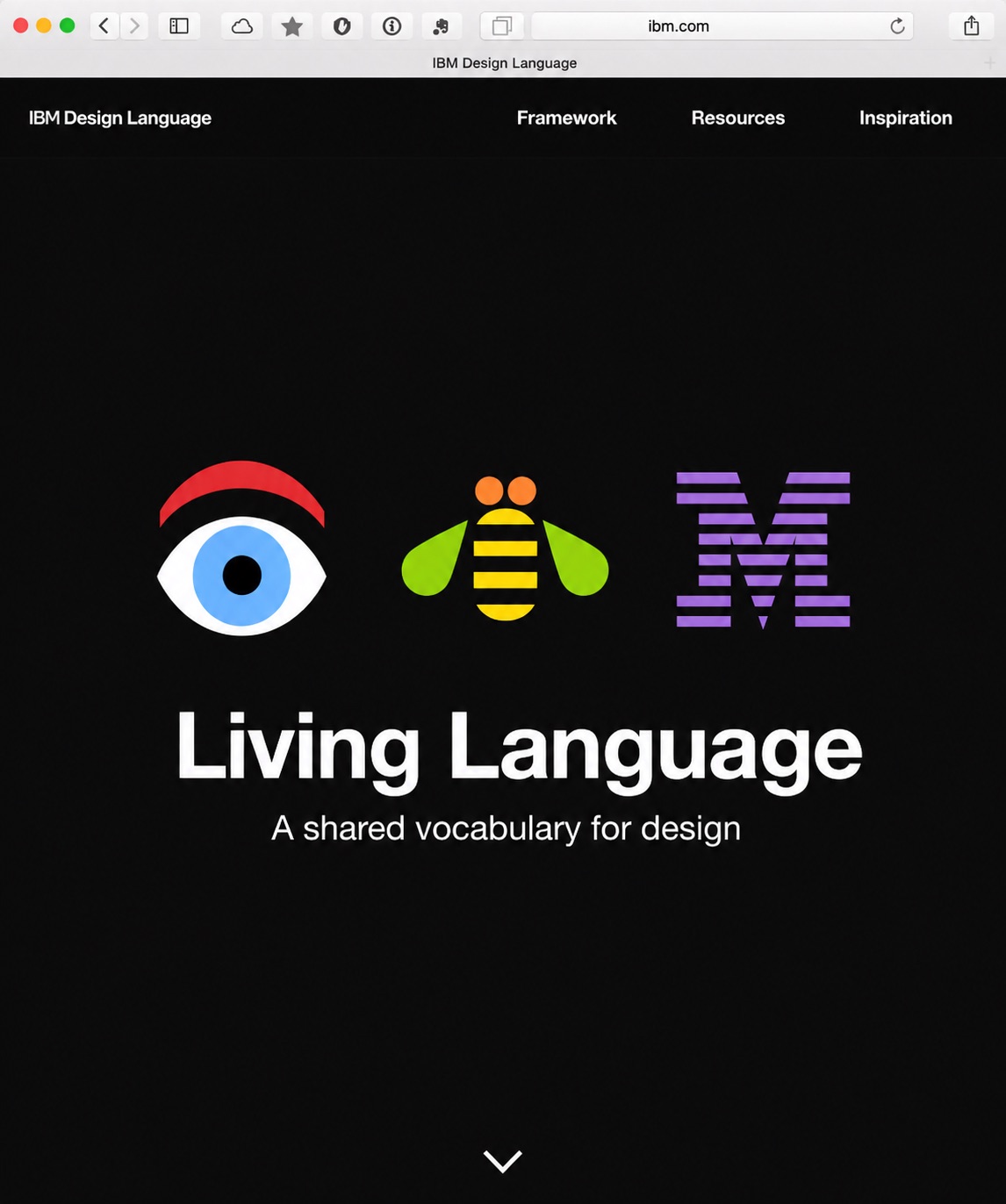
So we didn’t build a pattern library. We built a language. A language doesn’t hand you sentences. It gives you a way to say new things that still sound like you.
A living language
The IBM Design Language is a set of living guidelines that communicates a brand promise through the experiences of IBM’s products. Living is the operative word. The language was designed to grow, absorb what teams learned, and fold the best of it back into itself.
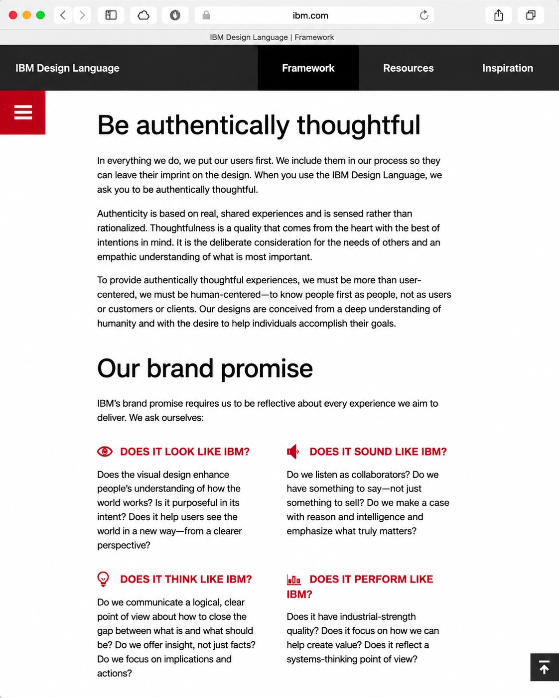
The brand promise came down to four blunt questions. Does it look like IBM? Does it sound like IBM? Does it think like IBM? Does it perform like IBM? Any team could ask them, with or without a designer in the room. That was the point.
It replaced IBM OneUI, and the difference in ambition mattered. OneUI wanted every product to reuse the same parts. The Design Language wanted every product to be recognizably IBM and unmistakably itself.
“Be authentically thoughtful.”
IBM’s products were lacking humanity
OneUI was meant to unify product offerings with a common set of reusable UI components. The emphasis landed on the code instead of the person on the other side of the screen. While OneUI was serviceable, it didn’t drive customer desire, and users had started placing a premium on experience.
Three problems:
Nondescript
The visual design had no strong connection to IBM’s brand architecture; it was missing market-definable characteristics.
Prescriptive
Interaction patterns were prescribed to designers and developers alike, producing sub-optimal experiences and forcing workarounds OneUI couldn’t adapt to gracefully.
Code-first
Implementation came first, so product experiences felt like transactions rather than meaningful interactions.
The clue was in the vocabulary. Reusable code. Acceptance boards. Nothing that mentions a human being or their needs.
Freedom to design fit-for-purpose
The hypothesis: a language gives teams freedom to design fit-for-purpose solutions while delighting users. Freedom and delight are easy words to say and expensive words to mean. The hypothesis came with three commitments.
- Authentically thoughtful. Authenticity is based on real, shared experiences. It’s sensed rather than rationalized. To provide authentically thoughtful experiences we had to understand people first as people, instead of users. When an experience feels like it was made for you, there’s an intimacy and loyalty that can only be earned.
- Maturation. Rather than race for reusability, let teams gain fluency with the language and learn what the possibilities are. Watch what they produce for two years. Then curate the mature patterns and roll them formally back into the language.
- Unifying. Products that use the language will look and feel like a family. Not forced conformity. Each product expressed as it needs to be to deliver on user needs, while still looking and feeling like an IBM product.
Notice what the middle commitment admits. We didn’t pretend to know every answer on day one. The language was designed to learn.
Keeping one argument alive
I co-conceived “authentically thoughtful” as the emotional spine of the work. Making that the central driving concept put the emphasis on human connection rather than code and implementation. Every other decision hung off that one.
Framing the body of work as a language instead of a set of human interface guidelines did something similar for the people using it. A language is a transferrable concept. People already know how languages behave. You learn them, you borrow from them, you get fluent, you say things nobody has said before.
The guidelines even carried a list of what the language isn’t: not a pattern library, not a process or framework to be complied with, not a set of themes or templates, not a paint job done at the end of a release, not lipstick on a pig. Funny on purpose, and load-bearing.
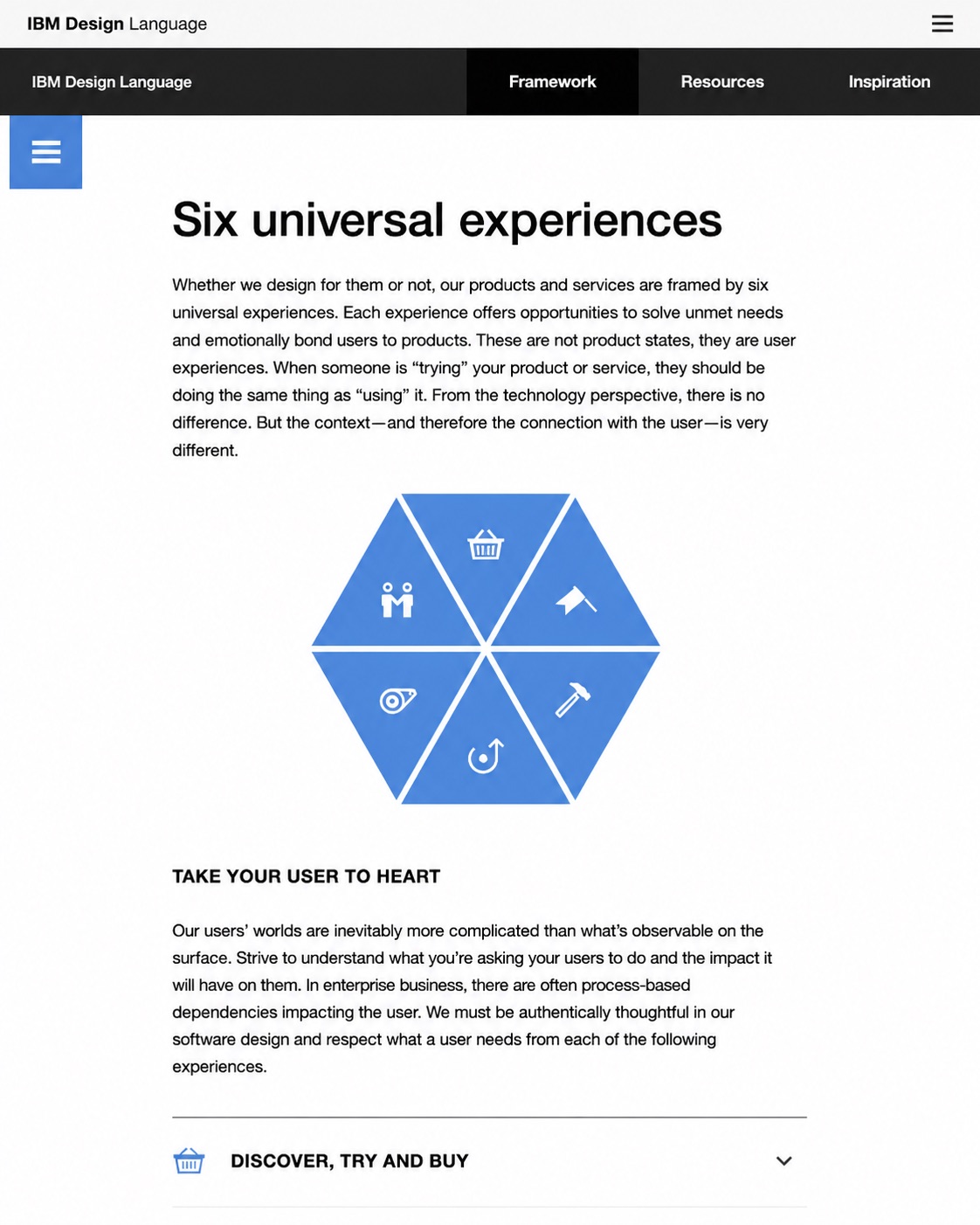
Working with Phil Gilbert, Charlie Hill, and Hayley Hughes, I co-developed the six Universal Experiences. They started with a comment I made to Phil: nearly every team designs for the app when all the data’s in and it’s well in use. Nobody thinks about first use, about what the interface looks like before anything’s been set up. So we got conscious about what the full lifecycle actually is.
Once teams were aware of the Universal Experiences, they had targets to hit. They could slow down and be intentional instead of playing whack-a-mole with design issues or making one big hand-wave full of suppositions, and they could focus their Hills and work in those areas consistently.
Discover, Try & Buy
Kicking the tires should let you experience as much of the real product as possible. No bait and switch, no gotchas left to be found after purchase.
Get Started
Truly experienced only once, starting the moment a user goes hands-on. With more complex software there’s a longer tail, but by design no more than a few days to a couple of weeks.
Everyday Use
The state every team was already designing for. Named as one of six, it stopped absorbing concepts shoehorned in from the other five.
Manage & Upgrade
The “eh, who cares about the admin interface” problem, plus the truth that upgrading enterprise software is rarely, if ever, akin to updating an app on your phone.
Leverage & Extend
Nobody architects their stack from one vendor’s offerings. Working with everyone else’s had to be easy and seamless, not a job for sales or forward-deployed engineers.
Get Support
When something inevitably goes wrong, users shouldn’t be stranded in IVR or chatbot hell. Support designed as well as the core experience leaves people feeling taken care of.
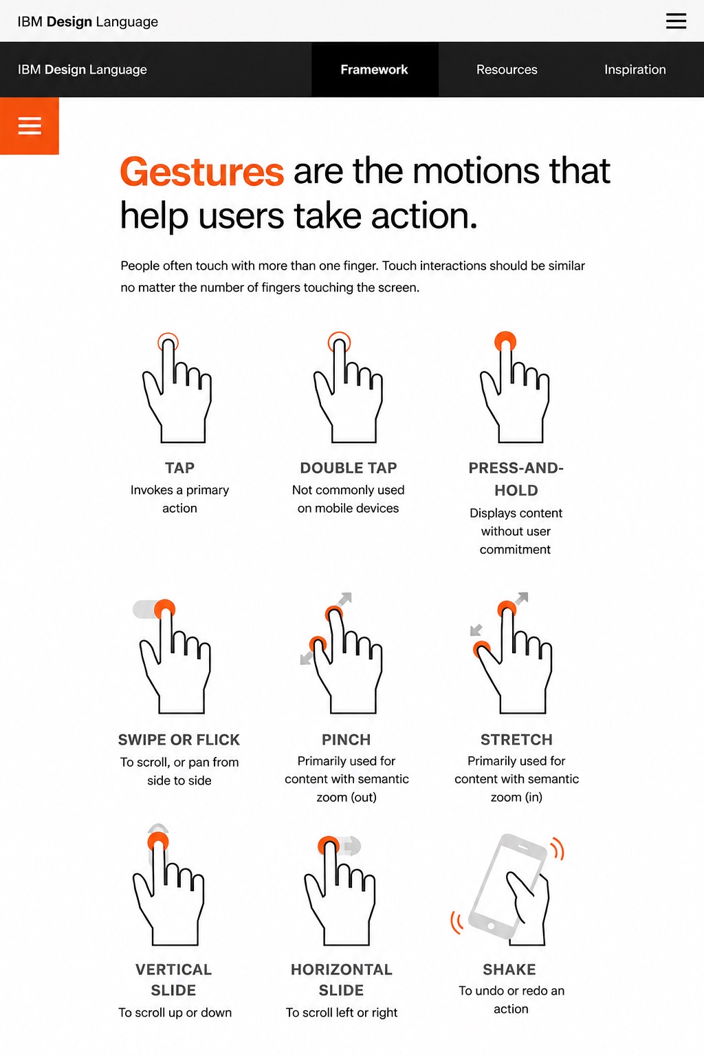
I directed the content tone. The language was going to be copy-heavy (like this portfolio 🤣), so it had to be an entertaining and light read. If you’re a designer, it reads as a trusted advisor passing along wisdom. If you aren’t, it reads as someone patiently explaining what you need to understand about the language.
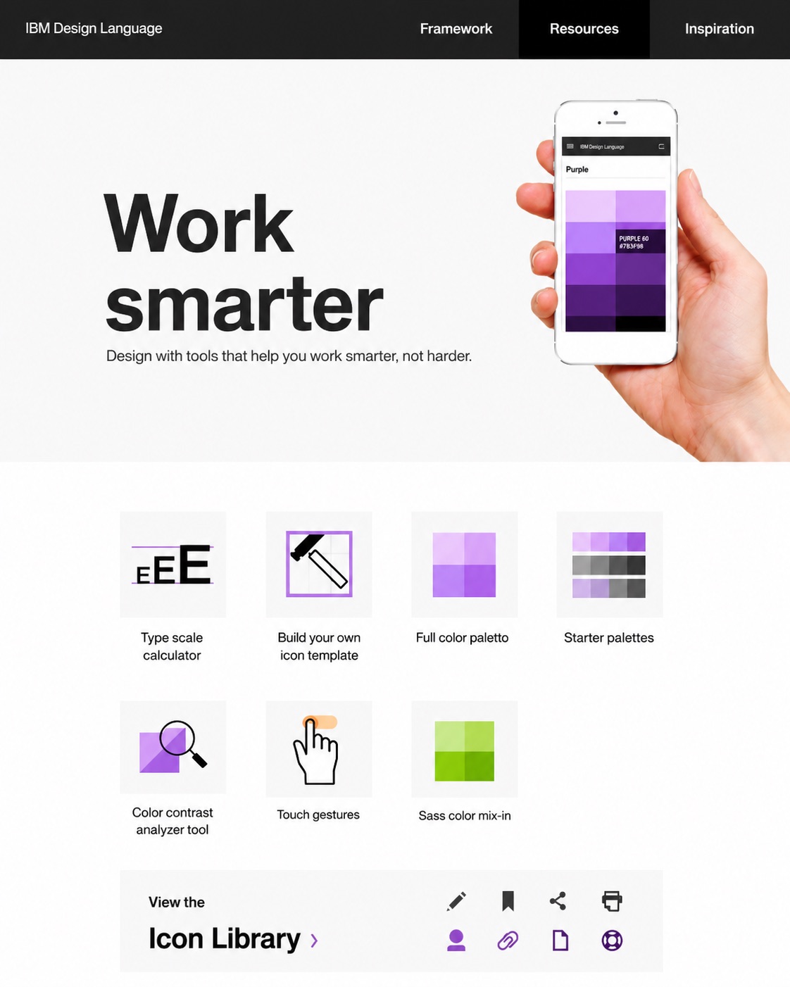
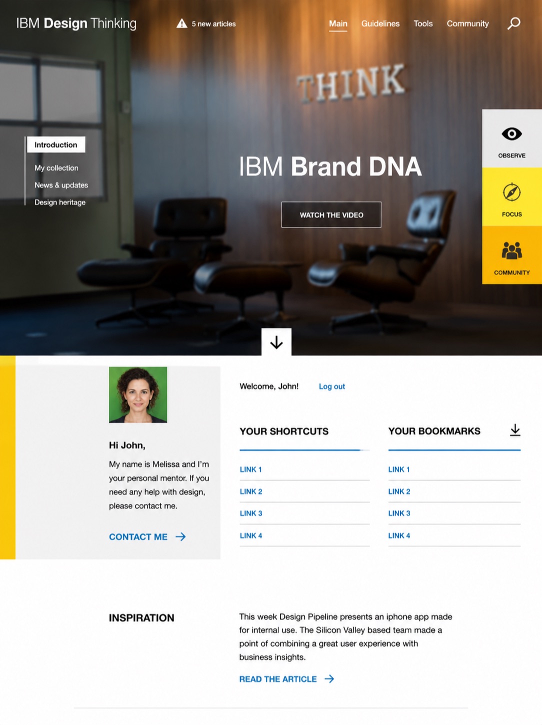
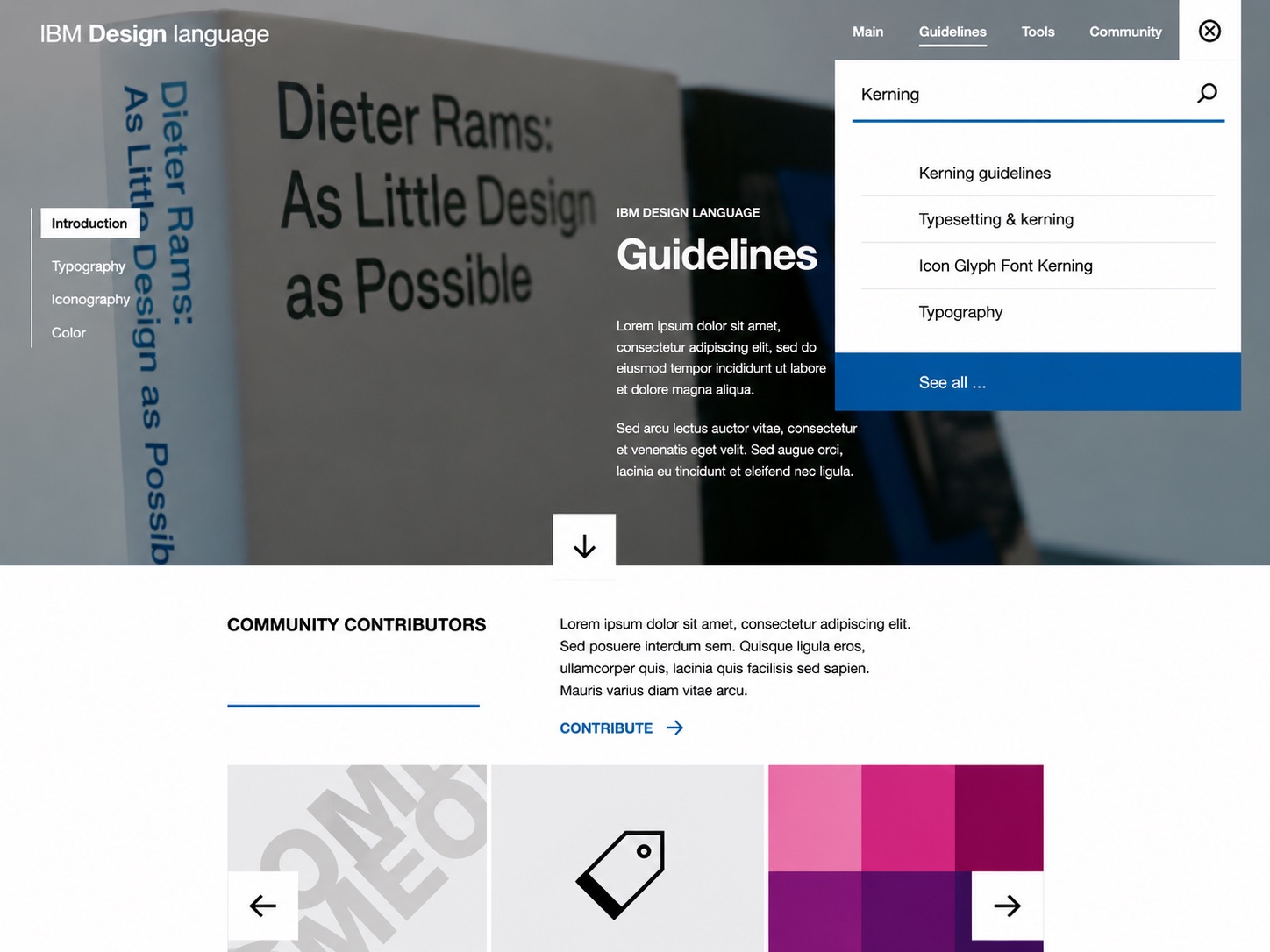
We didn’t guess at what people needed. I engaged the broader IBM through internal social media and surveys, and ran concurrent studies across multiple studios on the universality, or lack thereof, of our icon library. Practicing designers told us they needed quick access to tools and resources, so we created the Resources section for pick-up-and-go simplicity.
Some of the work was diplomacy. I worked closely with Terry Yoo, Vice President of Brand Architecture, to keep the language seamlessly aligned with IBM’s core brand concepts. And I learned a career lesson about accessibility and inclusive design from Frances West, our Chief Accessibility Officer. The inclusive design content had to be accurate, and the site itself had to be accessible. It’s one thing to write about inclusion. It’s another to publish in a form that includes.
So the language shipped the receipts: five typographic accessibility practices, high-contrast icon swaps keyed to the operating system, and a contrast matrix over the entire palette marking exactly which text stays readable on every color.
Connecting past to present
All of our supporting material was crafted to carry a deeper meaning than the content seemed to portray. The animation guidelines are my favorite example. Hayley Hughes and I traveled to Böblingen, Germany, to film IBM’s vintage machines in action, so we could draw a direct line from our animation principles to the way our machines used to move and behave. It connected the past to the present in a manner that wasn’t forced. Just clever.
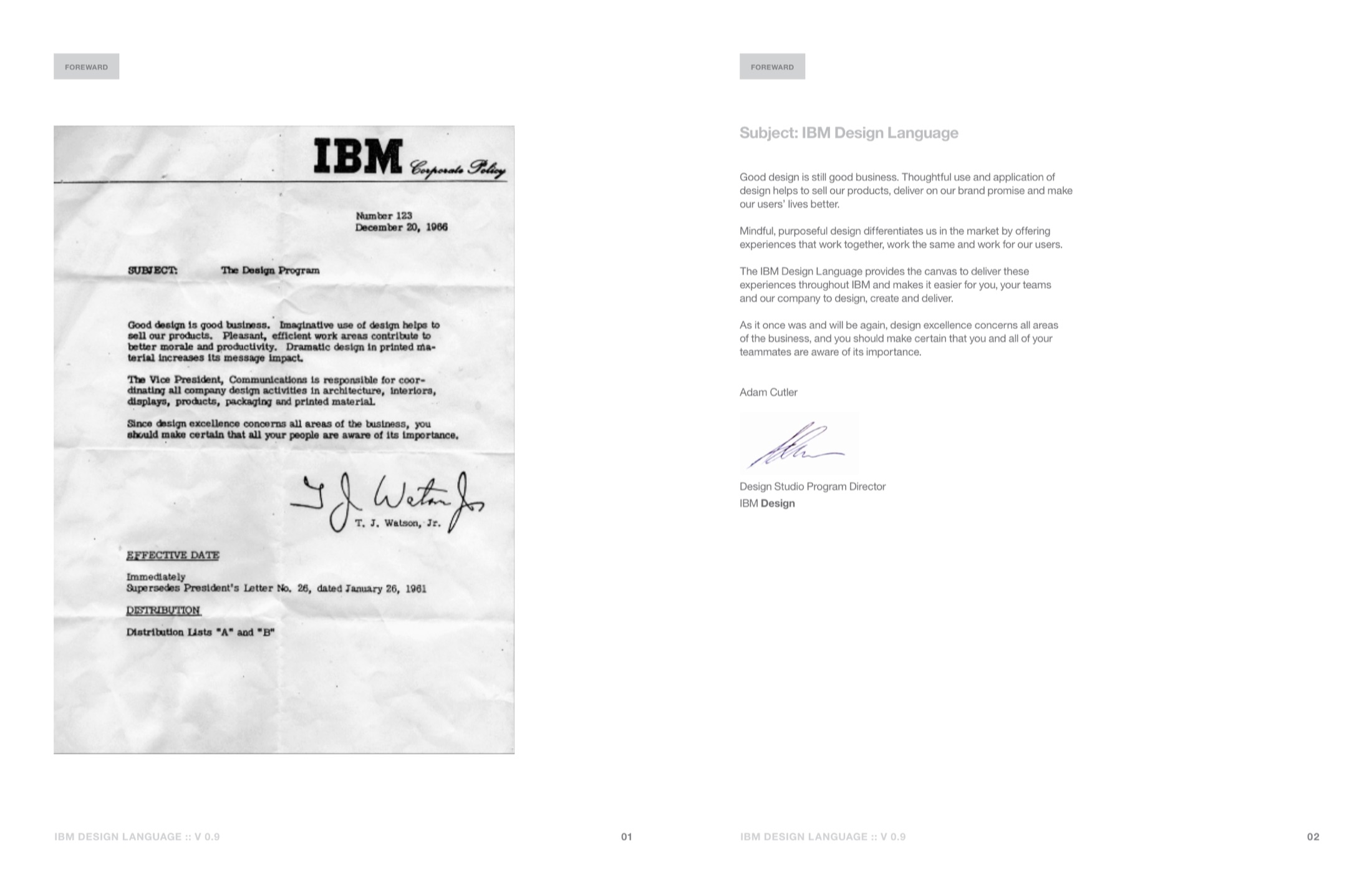
The foreword made the same connection in writing. Version 0.9 opened with a reproduction of Thomas Watson Jr.’s Corporate Policy Letter Number 123, December 20, 1966: “Good design is good business.” On the next page I answered it with a letter of my own, opening “Good design is still good business” and promising experiences that work together, work the same, and work for our users. It closed the way his did, because design excellence still concerns all areas of the business.
Technology as medium
I directed the conceptual development of a custom content management system to speed production, and we used GitHub to make the living language real. Content creators from across IBM could add their work asynchronously, and my team curated what came in. The language could grow without waiting on a release cycle.
I also led Idean, our third-party vendor, in building desktop and iOS Swift animation code repositories and provided creative direction for the interactive elements that brought the content to life: the icons, the interactive color palette, the color wheel, and the animation examples.
A flat PDF & the living language
The first version shipped as a flat PDF in July 2014. Designers had been asking for something to work from as OneUI was being sunset, and I wasn’t going to make them wait for a website. So v1.02 went out with the beginnings of the principles and guidance on typography, iconography, and color, built on foundations from designers around IBM, including work by Denise Shaw and Cale Vardy.
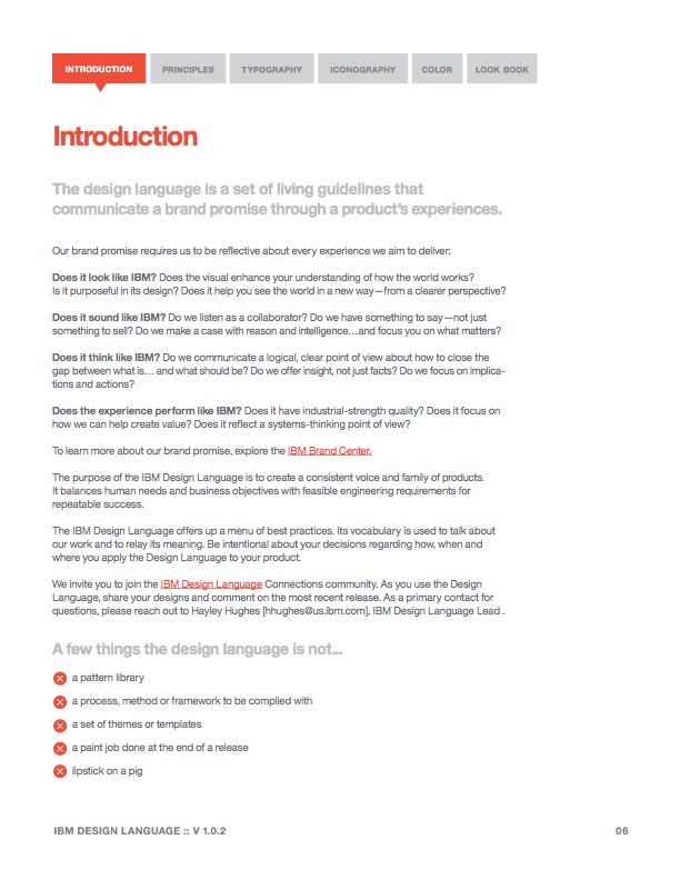
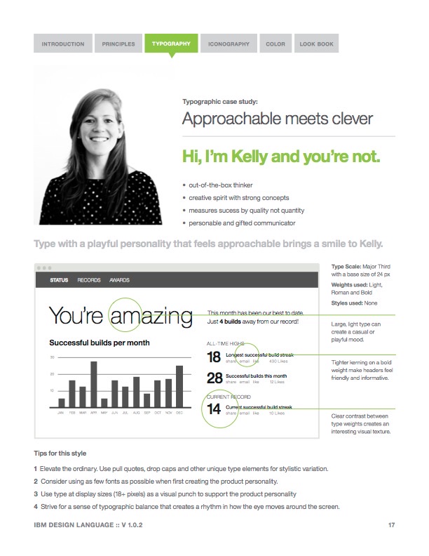
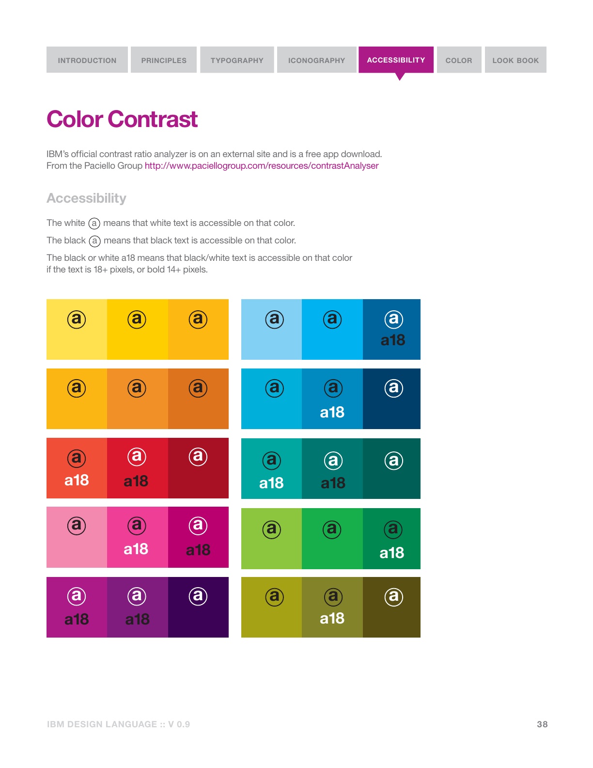
A flat PDF is a funny way to launch something you keep calling living. It was also the right way. The blog post introducing it drew 60 comments full of requests and observations from people actually using it. Armed with that feedback, Hayley and I set out to create the website we had pictured from the start, expanding the language into interaction design, inclusive design, and user experience design.
As early as v0.9 the principles numbered seven: users first, contextually aware, aesthetically pleasing, fun to use, clear and in-context, obvious, everywhere. The wording did the arguing. The focus on users had to be unwavering. The language doesn’t call attention to itself; it elegantly defers to its surroundings. And under obvious sat an admission most guidelines won’t make: many of our solutions are needfully complex. What’s necessary isn’t simplicity. It’s an inherent sense of obviousness.
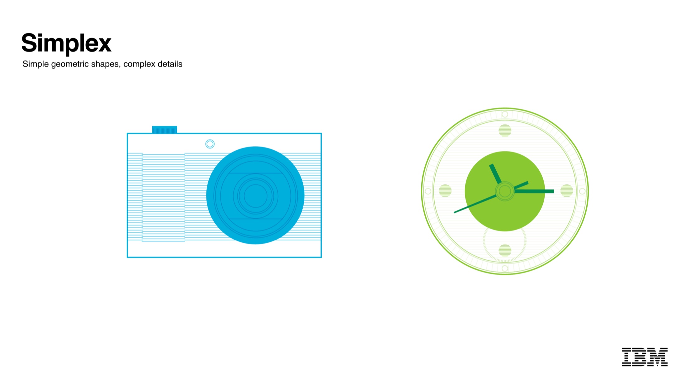
The iconography got the same discipline. With Idean we iterated seven directions until we found the right combination of scientific precision and warm humanity. The first 20 icons covered the most common needs across IBM. Another 150 were drafted and 100 selected, after a multi-studio research study eliminated 50 with mixed global or cultural misalignments. And along with the icons, I co-wrote the guide to making your own, because a language you can’t add words to isn’t living.
complex details
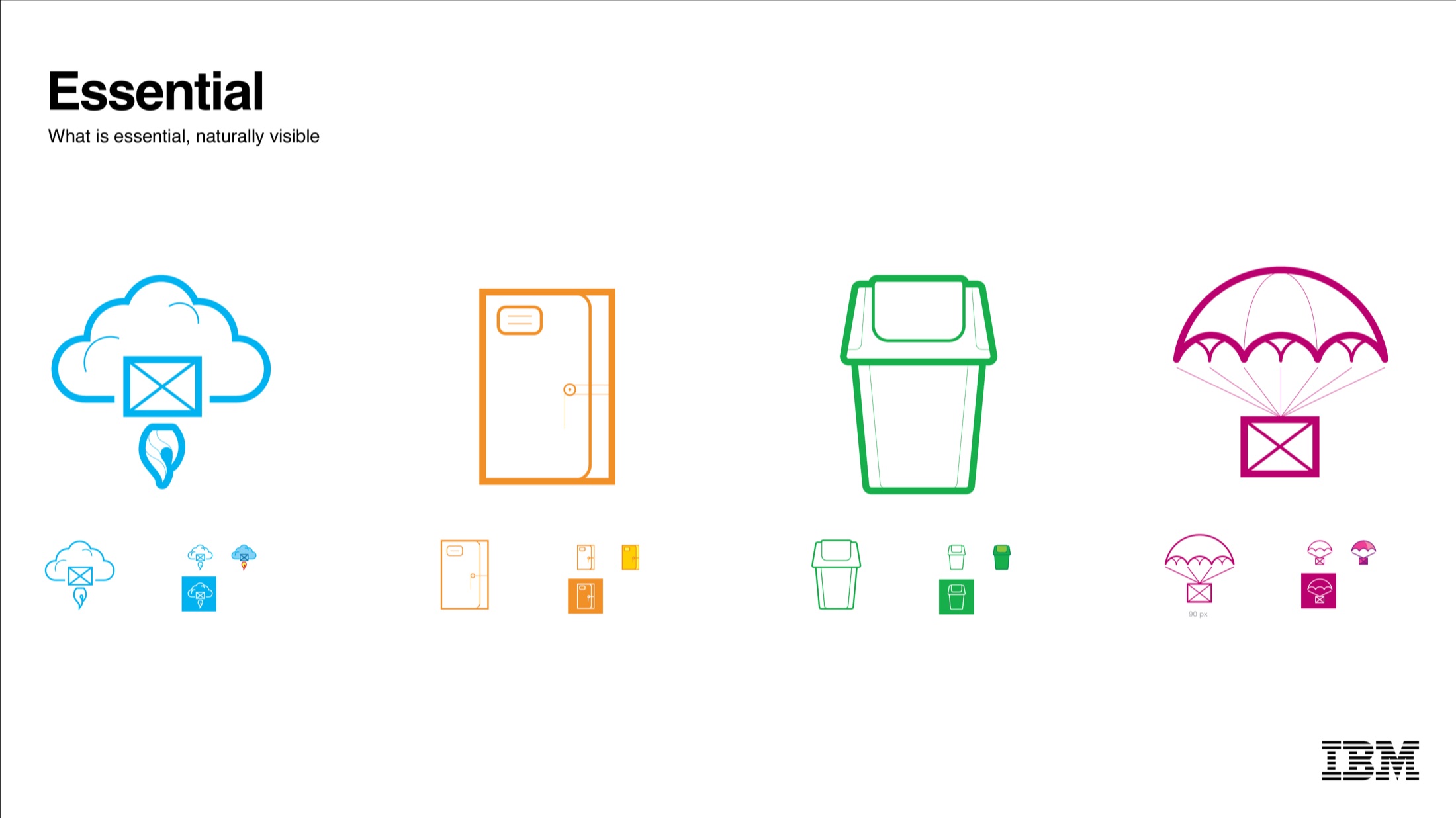
naturally visible
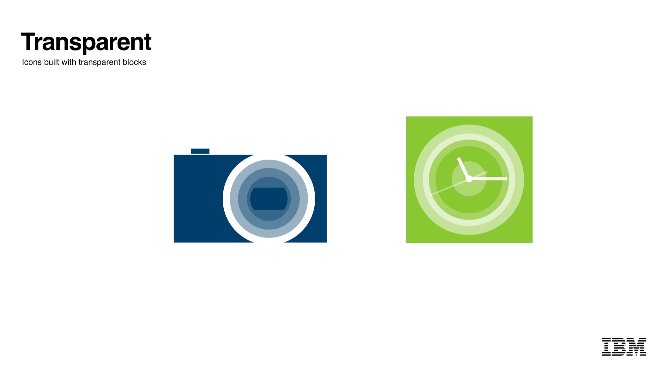
transparent blocks
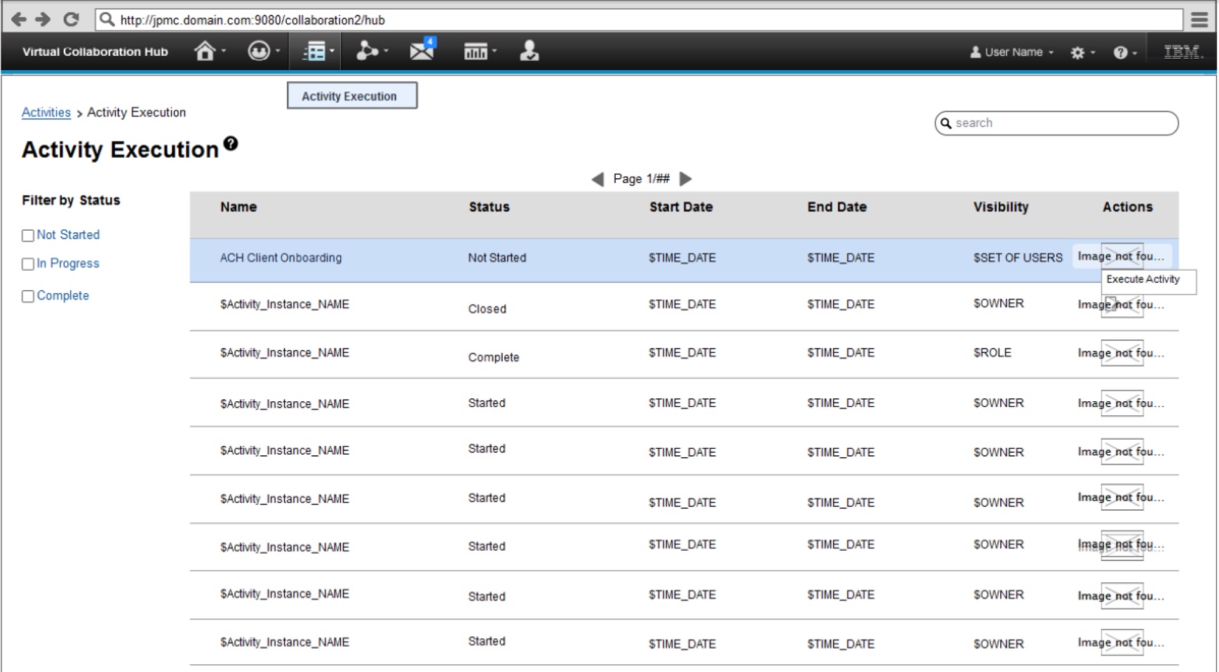
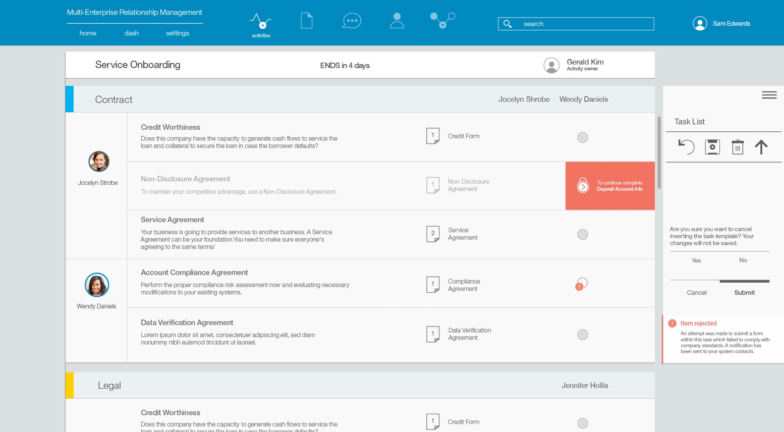
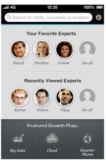
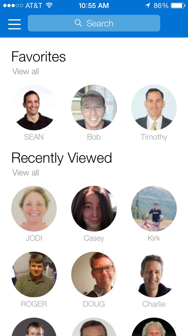
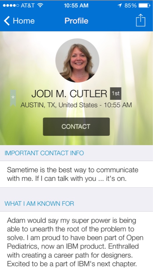
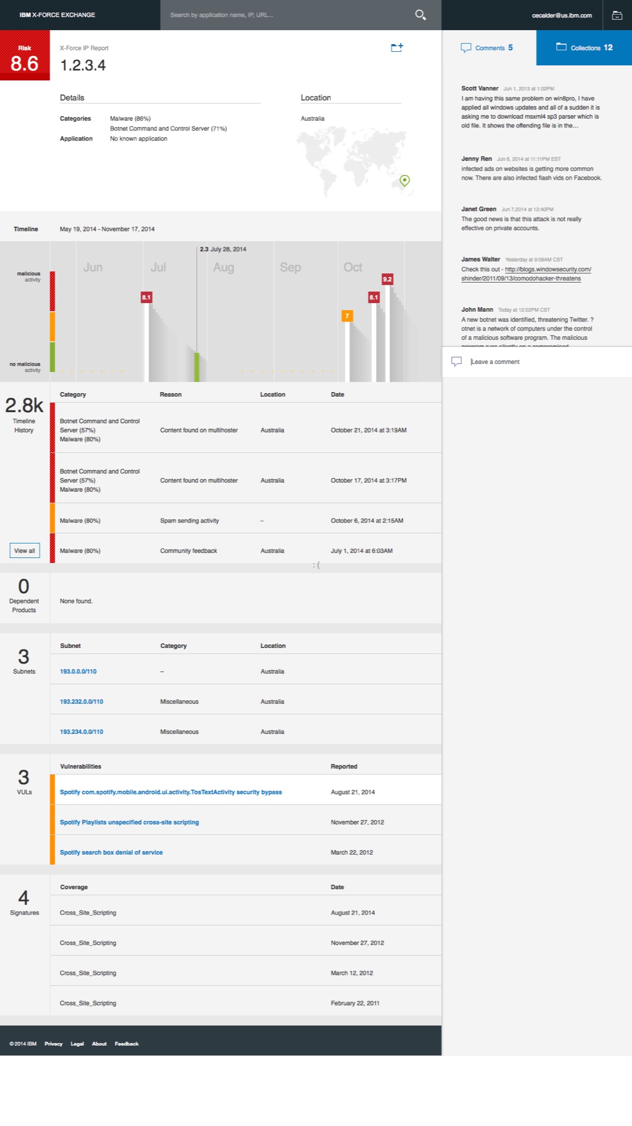
Early adopters made the case better than we could. IBM Expertise was one of the first, and the before and after told the story at a glance. IBM MRM had been conceived in OneUI and was redesigned using the Design Language: clean, modern, and built with a small amount of guidance. That phrase was the victory. A small amount of guidance. Not a pattern library.
Adopted, and noticed
The IBM Design Language was released to the world on 20 December 2014. It’s been adopted by almost every IBM software product and has since evolved and been open-sourced, with other organizations using its core principles in their own work. The release date was 48 years to the day after Watson signed Policy Letter 123.
Outside the company, the response was the kind you don’t get to script. Mark Boulton listed the design language sites that had caught his eye and put IBM first, ahead of Pebble and the Apple Watch guidelines. And John Gruber wrote words he never expected to write.
“IBM Design Language: words I never expected to write: elegant, thoughtful design guidelines and examples from IBM.”
“For a company I don’t associate with good design, this design-language documentation from IBM is really impressive.”
“Have you seen the IBM styles? Shockingly good.”
The internal note I keep returning to said the new guidelines weren’t like the old ones, the kind that told you whether to place a colon at the end of a label. These took things up a level, toward the essence of design.
What changed
OneUI unified components. The Design Language unified intent. Designed to endure over time, it embraced the fusion of scientific precision and warm humanity. It wasn’t a flavor of the month. It was meant to connect the power of our offerings to the richness of our brand promise.
And the thousand designers came (along with about 2,000 more). They didn’t walk into a box of parts. They walked into a language that expected them to have something to say.
What still matters
This work is a decade old, and the question underneath it has come back around. AI can produce screens faster than any pattern library ever did. The distance between wanting a product and seeing one has nearly collapsed. So the hard question is no longer whether you can make something that works. It’s whether what you make still sounds like you.
That’s a language problem, not a component problem. Components tell you what to reuse. A language tells you who you are when you say something new.
Authentically thoughtful was never about polish. It was about whether the person on the other side of the screen feels considered. Machines can generate the artifact now. The considering is still ours.