IBM Carbon for AI
When AI shows up in your software,
how do you know?
In the summer of 2023, IBM shipped watsonx and every software team in the company got the same assignment: embed generative AI in your product. Not eventually. By THINK, IBM’s major annual conference, the following May.
Underneath that assignment sat a question nobody had a good answer for. When AI shows up in the interface, what does it look like? We started by auditing the work already underway across the portfolio: where AI appeared, what it was doing, what teams were inventing, and where the same problems were being solved over and over. The finding that stopped us cold was simpler. Designers sometimes couldn’t identify where AI was active in their own products. If we couldn’t tell, our users didn’t stand a chance.
At the time, the answer was whatever each team decided last sprint. A sparkle icon here. A purple gradient there. Sometimes nothing at all, which is the version that should worry you. Generative AI is confidently wrong in ways deterministic software never was, and if a person can’t tell which parts of the screen were generated, they can’t decide how much of a critical eye to bring. An invisible AI isn’t neutral. It’s a trust problem wearing a clean UI.
So the real assignment, the one with my name on it, was this: give AI a body. One shared language, every product, in ten months.
The chassis
Some context first. Carbon is IBM’s open source design system. Working code, components, guidelines and Figma kits that most of the software portfolio is built from, sitting on top of the IBM Design Language. The economics are why it matters here: teams save roughly 2,000 hours of design and development per pattern they don’t have to reinvent, and front-end efficiency improves by about half. Software leadership had already declared that a unified experience, done right, was worth 20 years of tailwind. If you want a behavior to exist in every IBM product, you don’t write a memo. You put it in Carbon.
Carbon for AI became an extension of that system, but calling it a component library misses most of the point. We needed a foundation for responsible AI, a body of guidance for making decisions, a visual and behavioral language, and working code teams could actually ship. Principle to pattern to component to product.
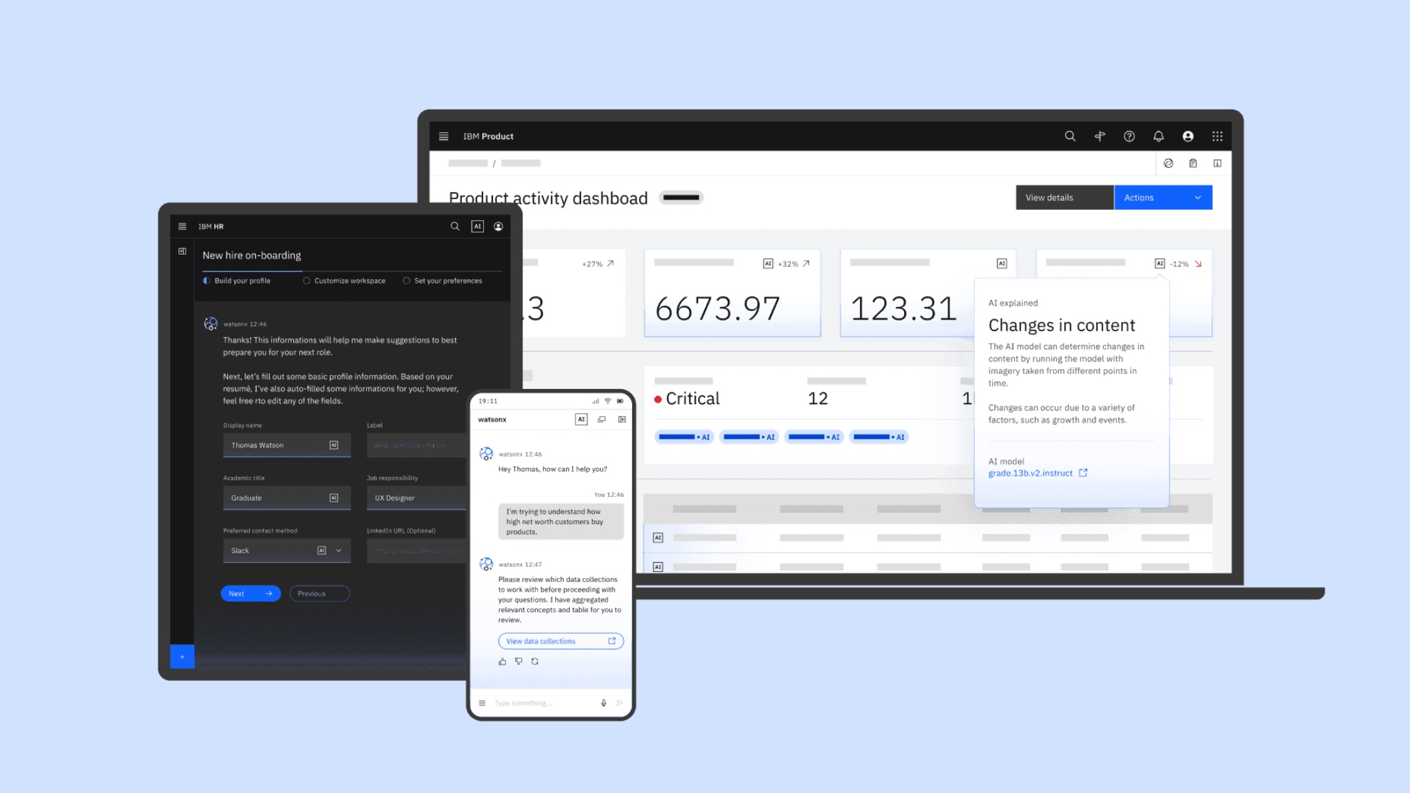
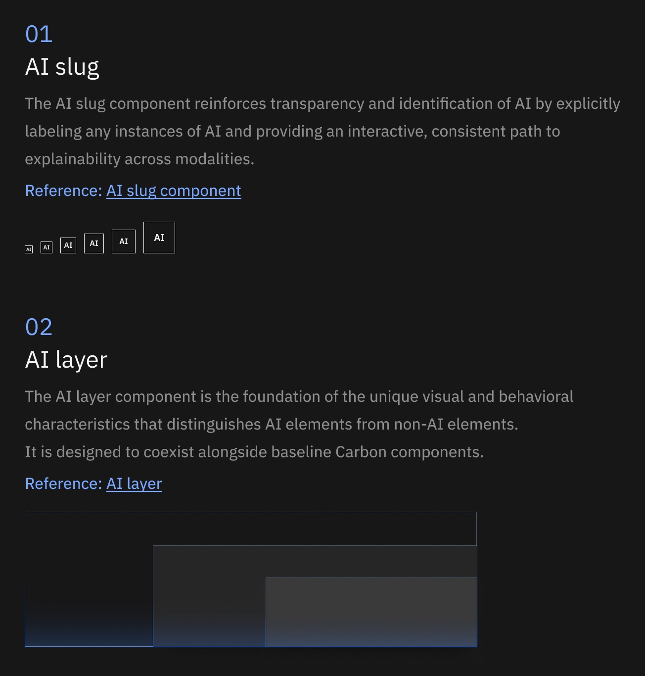
The intelligent layer sits over base Carbon and gives any instance of AI a visually and behaviorally distinct identity. Two elements do most of the work. The AI Label, a small interactive mark that says AI made this and opens the explanation. And the AI Layer, the foundation for everything that makes AI content look and behave differently: luminance, elevation, gradients, rounded corners, and a suite of tokens that live inside the existing light and dark themes rather than forking them.
The mission around it had a name only a large company could love: M2W3. Mandate two, workstream three. Create and scale a process for IBM Software teams to embed watsonx-based generative AI into our products. Engineering, product management, pricing and program each held a seat at that leadership table. I held design.
Three problems, stacked
Recognition
Users had no reliable way to tell generated content from built content. Our audit made the problem uncomfortable even inside IBM: designers sometimes couldn’t identify where AI was active in the products they were designing. Trust requires disclosure at the moment of use, and the moment of use can be a table cell, a form field, a paragraph in a chat. A policy PDF doesn’t reach any of those. Neither does a launch blog.
Reinvention
We had roughly 200 enterprise products in scope, and teams were already solving the same problems in parallel. Everyone had their own version of “this is AI.” Their own interaction patterns. Their own chat conventions. Their own explainability. That’s duplicated effort measured in millions. Worse, our users move between IBM products and a myriad of other vendors’ products. 40 dialects of disclosure equals no disclosure.
Plumbing
The deadline was a keynote. The portfolio was spread across Carbon v10 and v11, React, and everything that isn’t React. Some teams were ready for the newest system. Plenty weren’t. A design language that can’t ship inside a team’s actual stack is a mood board.
Any one of these is a normal design problem. All three at once, on a clock, across a portfolio... that’s a systems problem. Those are the ones I take.
What if AI content had its own physics?
The first instinct across the industry was color. A new hue. A gradient. Some kind of sparkle to announce that intelligence had arrived. That wasn’t enough. We started thinking about AI as another layer of the interface, something operating in a different physical space from the deterministic software underneath it.
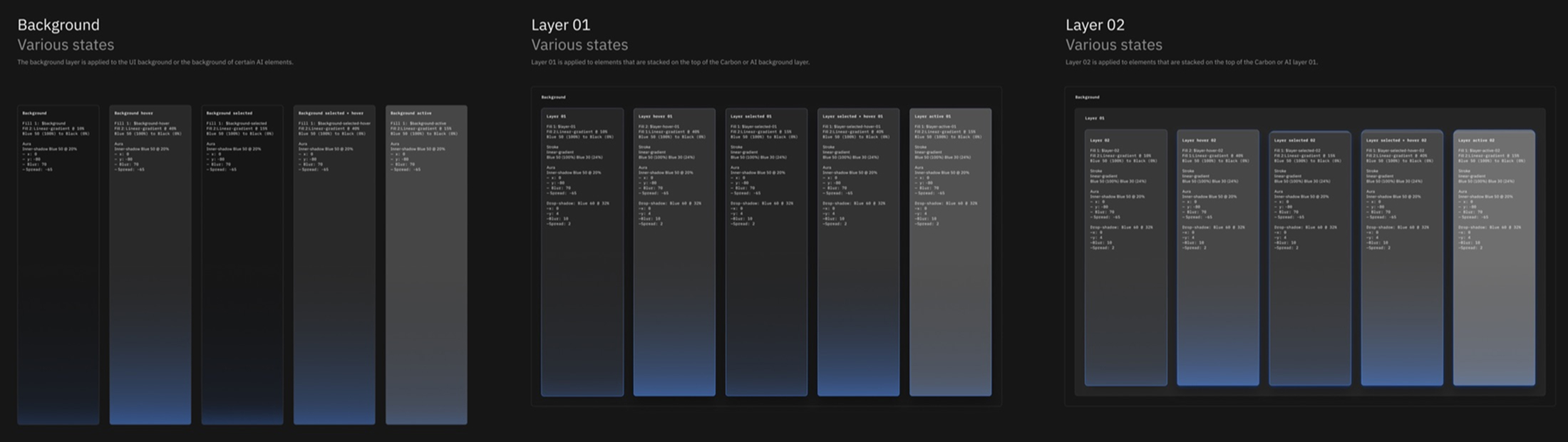
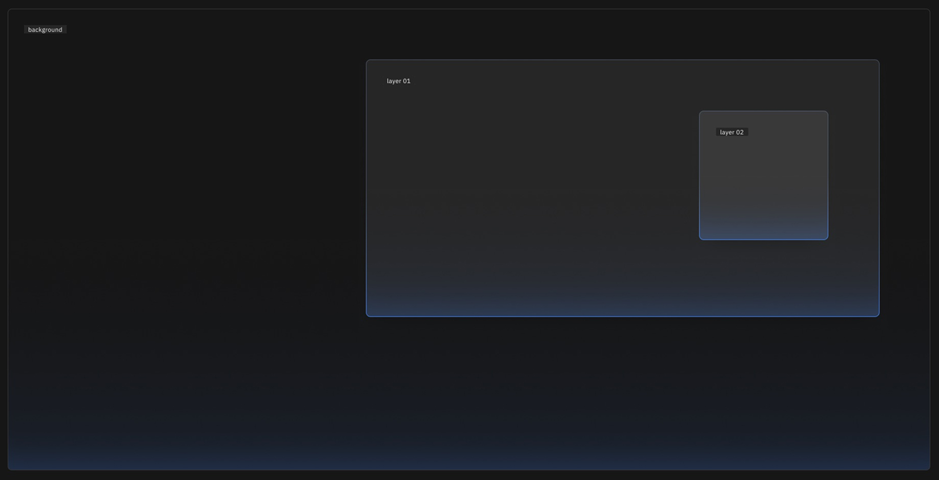
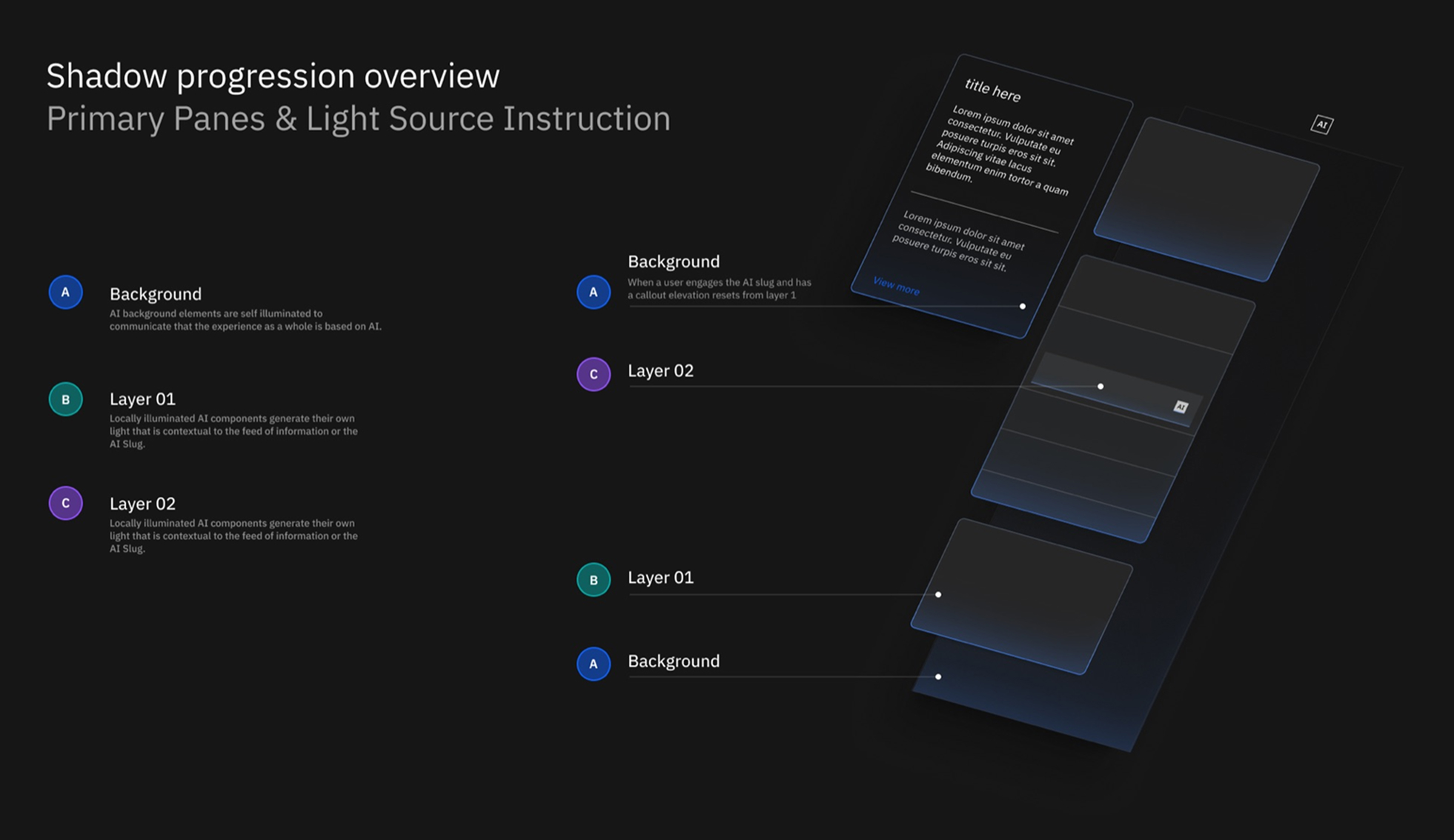
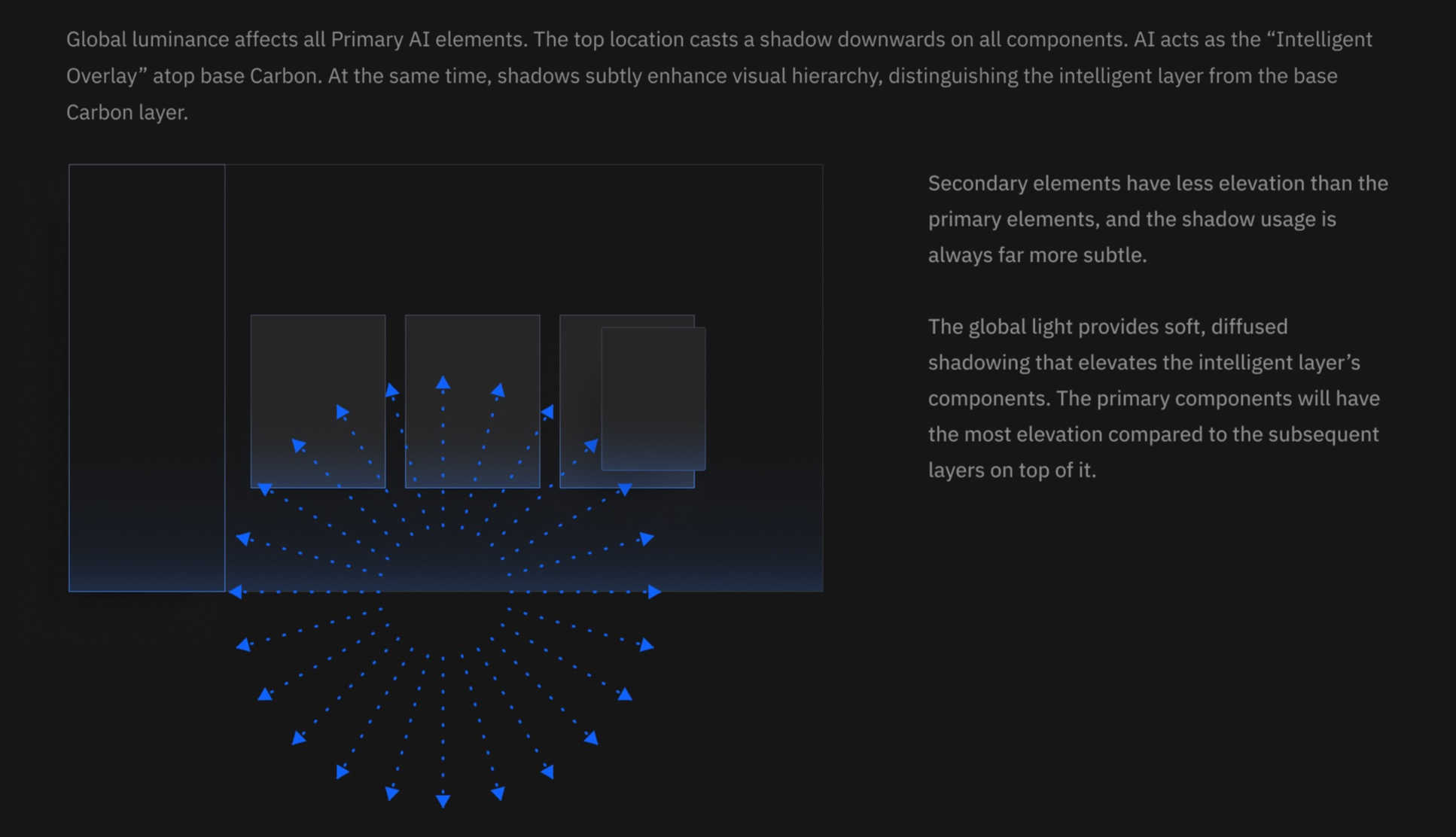
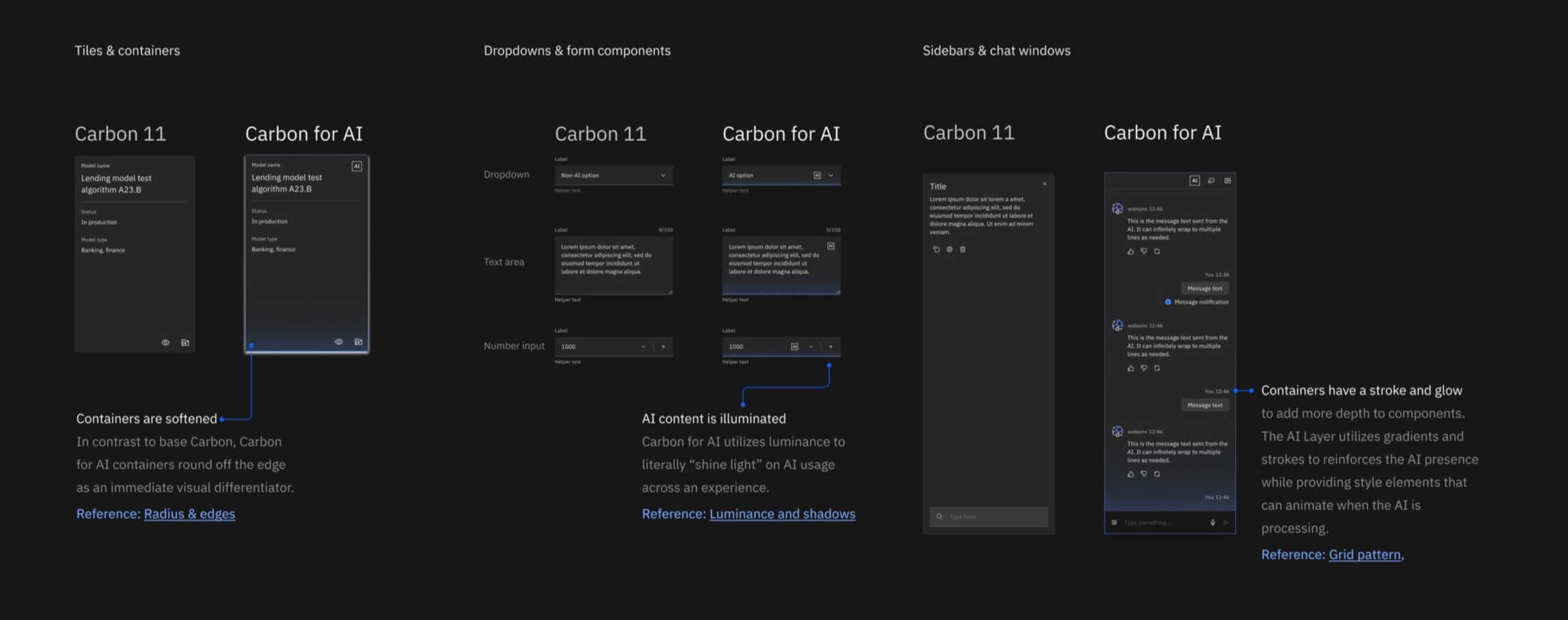
Light became the metaphor. AI illuminates the interface wherever it’s present. Luminance rises from the bottom of a container. Depth separates the intelligent layer from the base. Corners round where base Carbon’s were square. None of it is mood. All of it is signal.
And one small element carries the ethics. Mark every instance of AI with the label. Make the mark a doorway: click it and a popover explains what this is, how it works, what data it used, which model produced it. Need more? A tearsheet with the full documentation. Progressive disclosure, so transparency never curdles into noise.
The whole thing rested on four commitments.
Identifiable
Recognized at a glance. If a user needs a legend, we failed.
Explainable
The explanation lives where the AI is, one click deep. Never in a help center or three clicks away.
Systematic
New tokens inside the existing themes. Not a new theme. Not a fork. Base Carbon and the intelligent layer coexist on the same page without an argument.
Adoptable
Carbon v11 React and web components, escape hatches back to v10, Figma variable modes so a designer flips one switch. Meet teams where they are, not where we wish they were.
The light has a job. If nothing was generated, nothing glows.
dark themeStyle elements
a model inventoryStyle elements

dark theme
Keeping one idea intact
At this scale, the work wasn’t making every decision. It was making sure that hundreds of decisions still added up to the same idea.
I set the concept and held the standard: light as the identity, the layer and the label as the machinery, recognition as the bar. Then I assembled the team that could make it real, pulling people from wherever the right skills happened to sit. Ramiro Galan ran the project day to day. Vora Supadulya led visual design and built the illumination system with Fang Yun Shih. Dillon Eversman led UX with Julia Lubarsky. Milena Pribić and Claudia Elbourn, ethics and explainability, made sure explainable meant something a regulator and an actual human could both live with. Juan Encalada came over on a two-week Figma expertise loan and never left. And the Carbon core team, Mike Abbink, Anna Gonzales and Jeff Chew, turned design intent into shipping code alongside us.
But the team at the center was only part of the system. We built adoption into the work before there was anything to adopt. Sponsor teams met with us weekly. A 12-team early adopter cohort put the system into real products while we were still defining it, and across the broader effort, more than 15 product teams piloting AI helped pressure-test the patterns against actual use cases.
We ran one-to-one co-design sessions and more than 60 office hours sessions. Dedicated Slack channels gave teams a direct line back to us. Every product lived on a tracking board: Carbon version deployed, v11 migration date, web components or not, preview dates, GA.
The trick wasn’t getting teams to comply with a system we’d already designed. It was letting them adapt and evolve it without having it come apart. Their edge cases exposed what we’d missed. Patterns and components came back from product teams into Carbon for AI, where we could resolve the problem once and make the answer available to everybody else. The system shaped the products, then the products shaped the system.
That changed the economics of adoption. Every new team wasn’t another implementation problem for my team to solve. Done right, every new team made the shared answer better.
And sometimes leadership meant killing things. The best-looking direction we explored was frosted glass: blurred translucency behind AI content, genuinely gorgeous in a Dribbble way. I killed it. Blur made contrast unpredictable, which made accessibility unprovable. Stacked layers fought Carbon’s layering model. Light, pattern, fade and frost were all trying to say AI at the same time until the signal disappeared into the treatment. Gorgeous was never the standard. Instant recognition and understanding was.
Two smaller calls traveled surprisingly far. We designed one universal AI mark and localized it (AI, IA, KI, ИИ) so transparency didn’t quietly mean transparency in English. And we treated chat as its own beast.
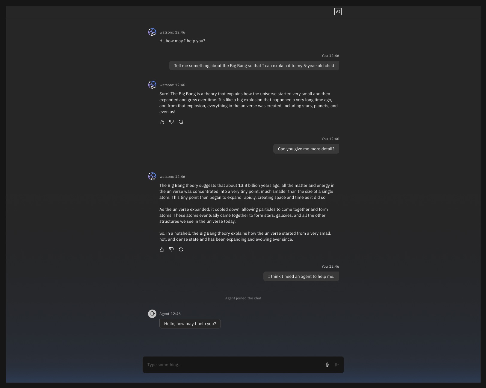
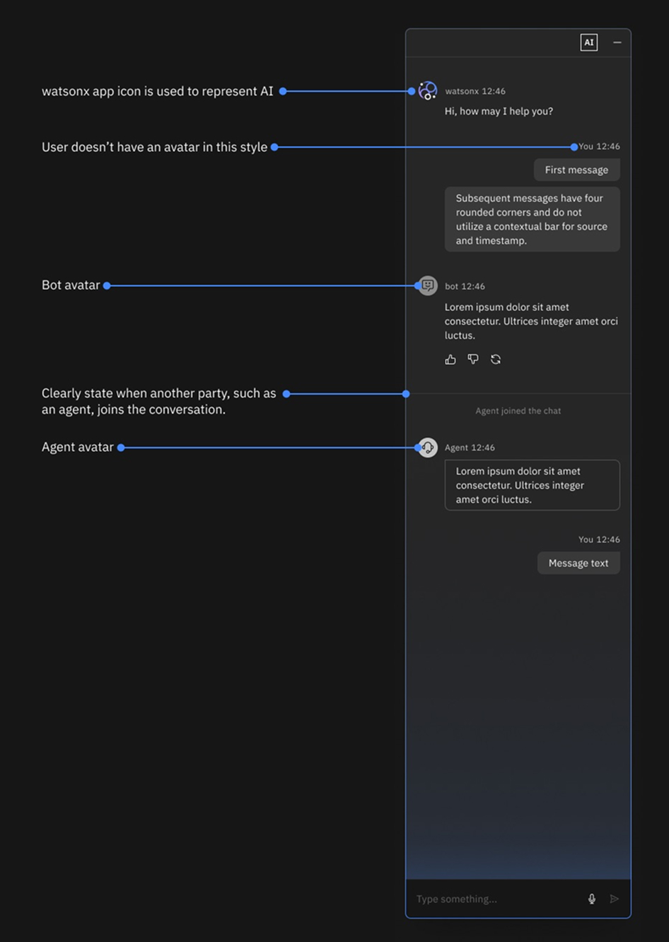
Chat was quickly becoming the dominant AI modality across the portfolio, but a chat isn’t a text box with bubbles. Streaming responses, citations, multi-turn context, errors, conversation history and explainability all have to behave together. Letting every product team figure that out independently would have been absurd.
So we partnered with the watsonx Assistant team and built the shared answer once: interaction patterns, visual guidance, a knowledge base and working components. The implementation was developed as InnerSource and became a common starting point for teams coming behind it. Phase 1 shipped in April. THINK was in May. Our work was showcased on stage with weeks to spare, which at enterprise scale is practically a miracle.
worked exampleMarch 2024
who said what
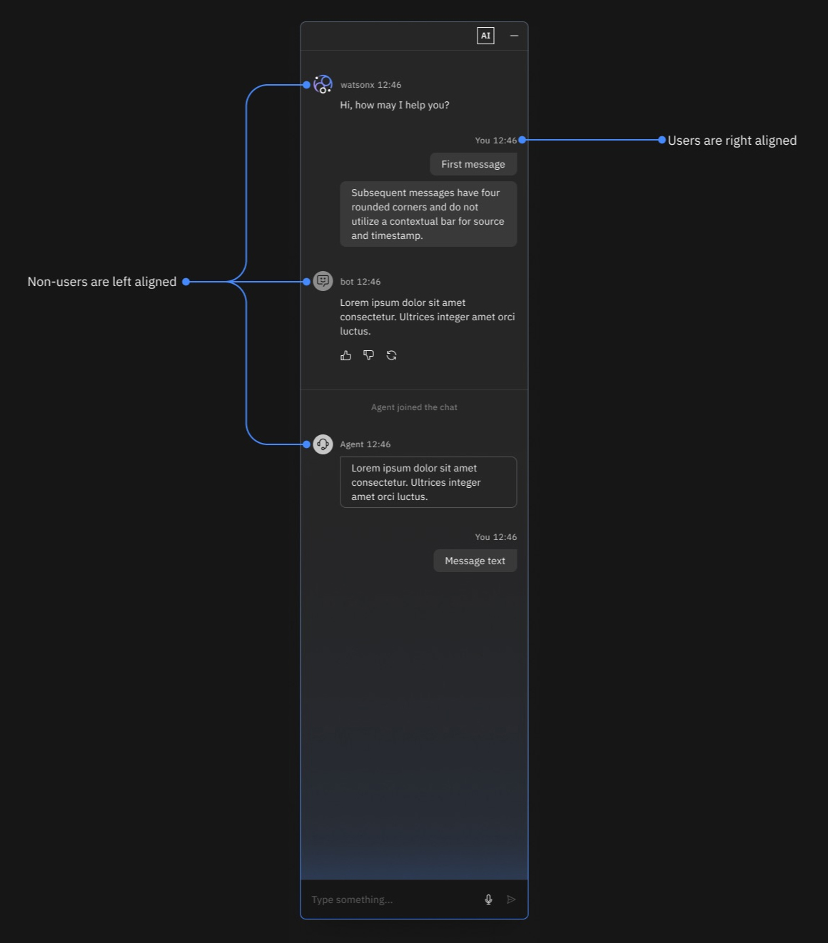
the two sides

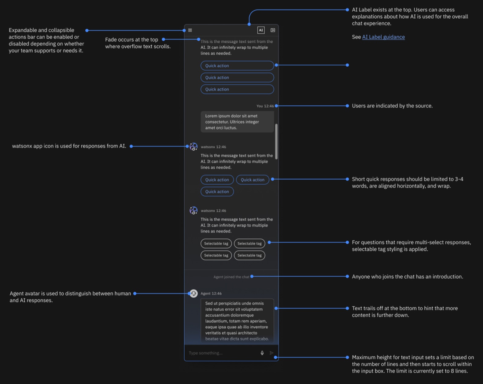
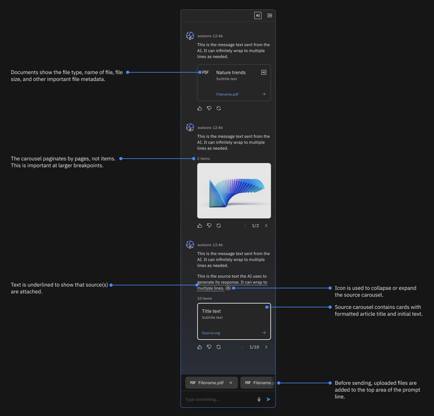
and links
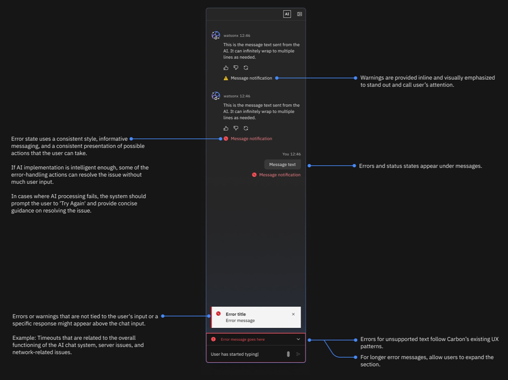
errors included
The smallest thing carries the most weight
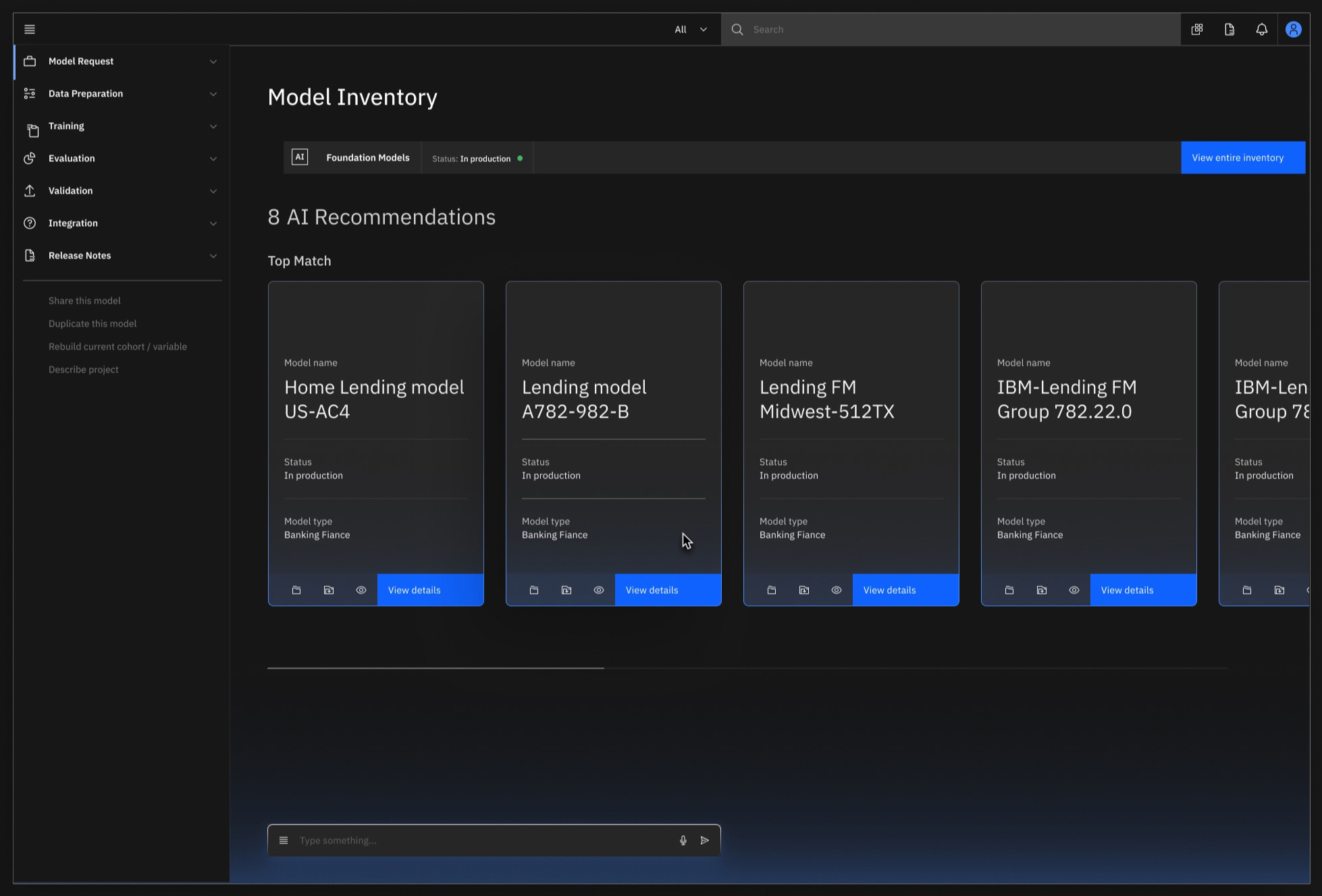
The AI Label began life as the “AI Slug,” an engineering name that stuck for a year before we renamed it for what it actually does. The AI Label marks any instance of AI at any altitude: a single table cell, a column, a row, the whole table, the whole page. Each has placement rules, and rules for choosing a focused label over a broad one, because a screen wallpapered in labels tells you exactly as much as a screen with none.
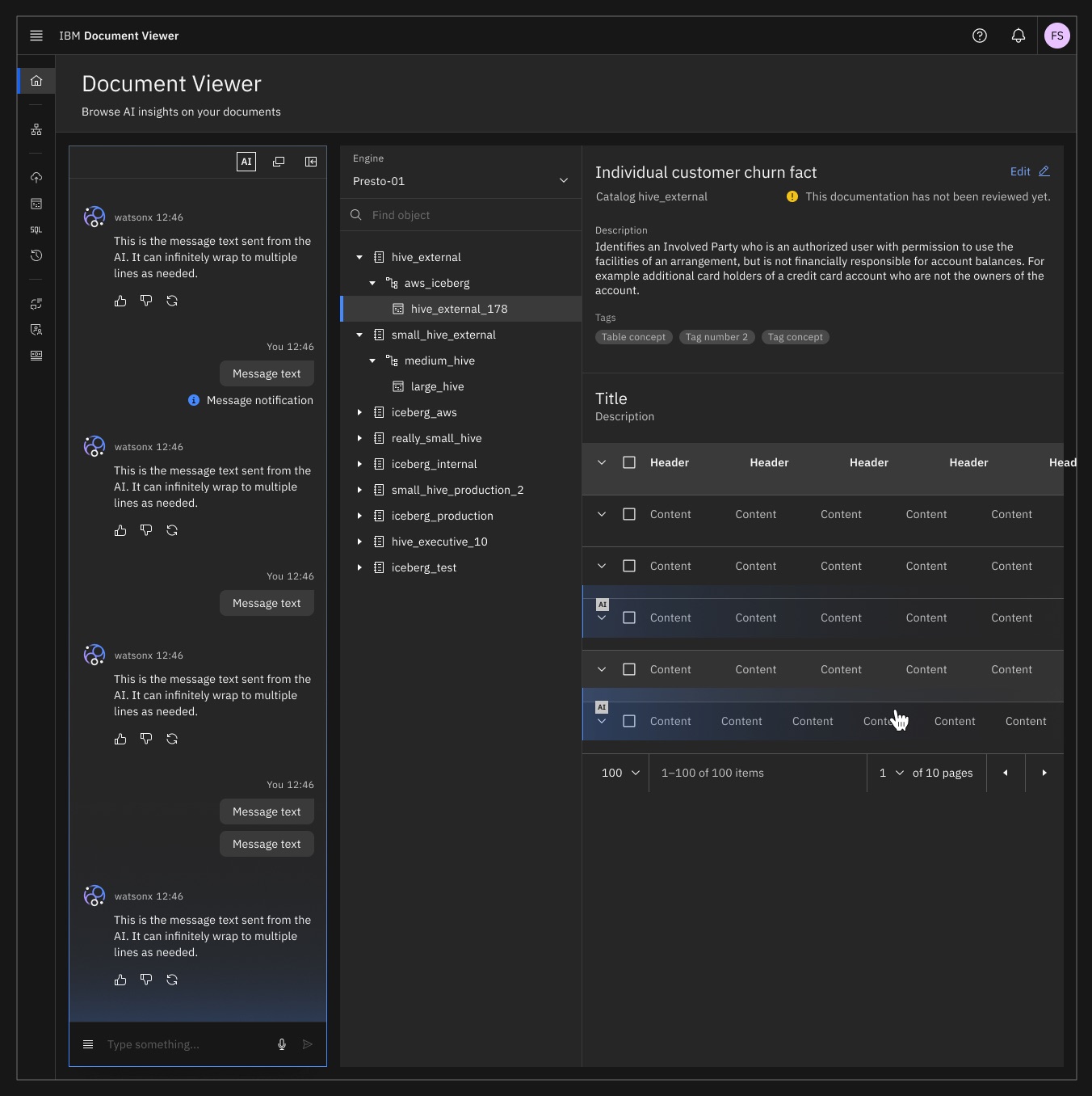
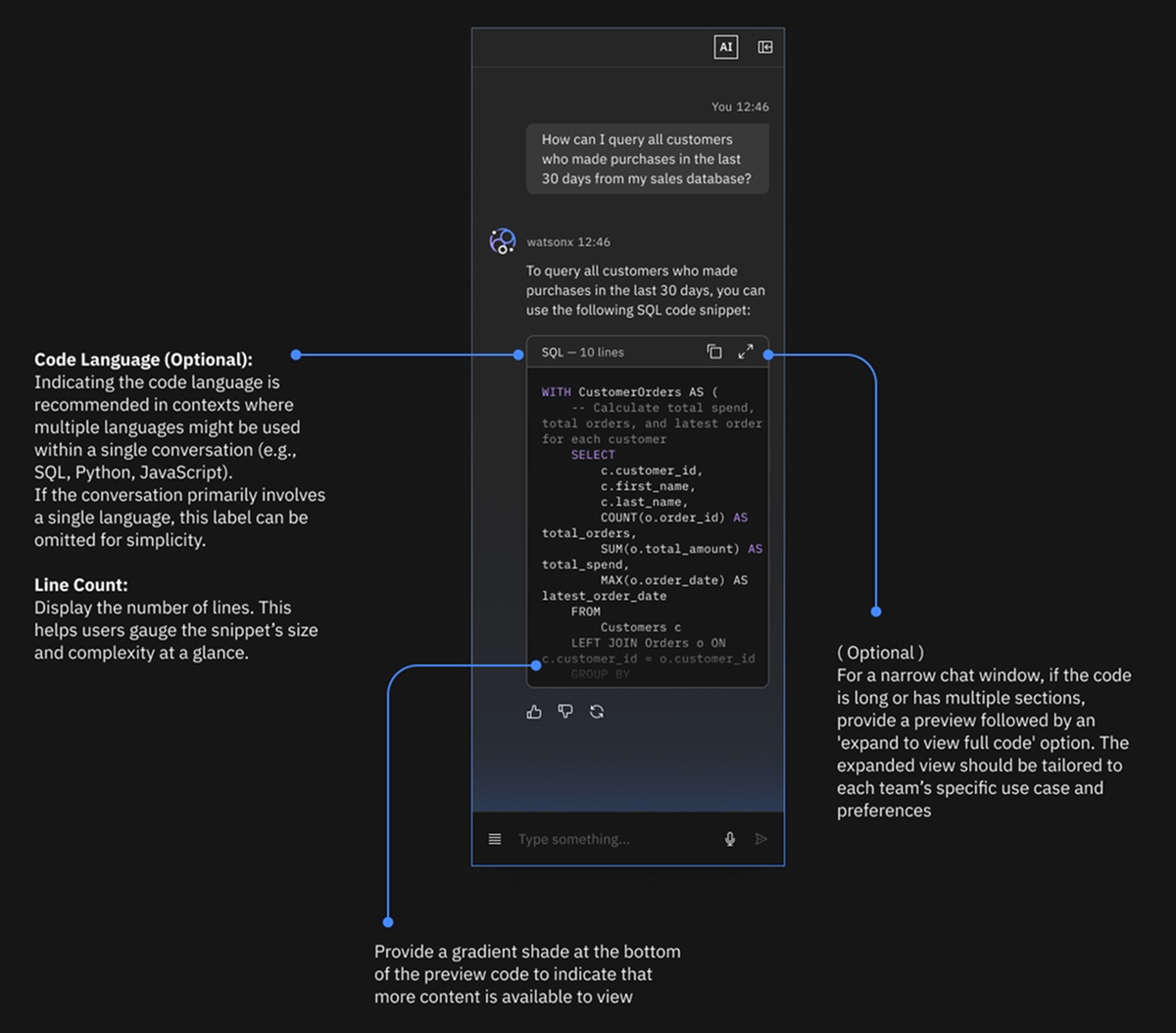
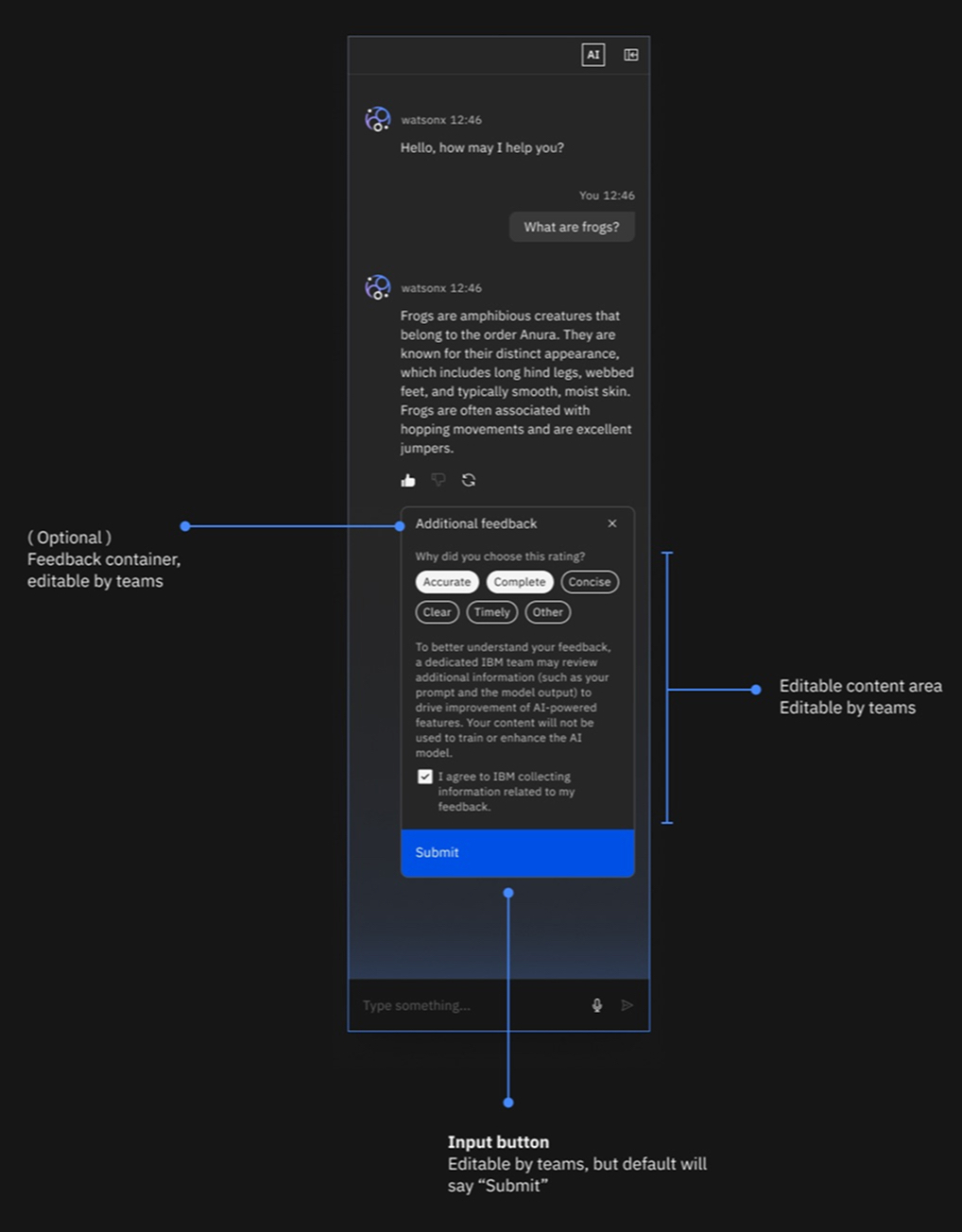
Click the label and the explainability popover opens. We templated its contents: the feature by name, a plain-language summary, how it works as numbered verbs (Review. Compare. Transform.), the data types involved, the model by name and version, a path to the full factsheet. We also templated what it may never contain: no legal disclaimers, no marketing. The popover always explains, never sells.
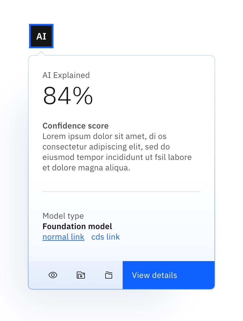
My favorite interaction in the system is the quietest one. When a person edits AI-suggested content, the AI styling falls away and the label becomes a revert button. Override the machine, fine. You can always get the suggestion back.
The human always wins the argument. The system keeps the receipt.
The physics got the same discipline as ethics. Light rises from the bottom, always. Small components glow inward; large ones cast upward. Light can hint at overflow, telling you there’s more AI content below the fold. It never appears on non-AI content, and shadows belong only to the primary layers. We budgeted light like money, because spent everywhere, it buys nothing.
Some components already existed in Carbon: forms, calendars, data tables. Where AI changed the requirements, we extended them. Where nothing existed, we built from scratch: explainability popovers, AI chat shells, inline AI indicators.
By the end of December 2023, 15 components were in working code. The public system now includes more than a dozen core components with AI variants, 20+ reusable patterns, light and dark themes, React and web components. The early adopters were 15+ products in the first year, and adoption later grew to more than 40 product teams across IBM’s portfolio. The better win was harder to count: teams stopped inventing sparkles.
We open-sourced it
We debuted Carbon for AI on the main stage at THINK in May 2024. Then we open-sourced it. The whole system, guidelines, and code live on carbondesignsystem.com, where anyone, including our competitors, can read it. Good. If AI disclosure only works inside IBM, it doesn’t work.
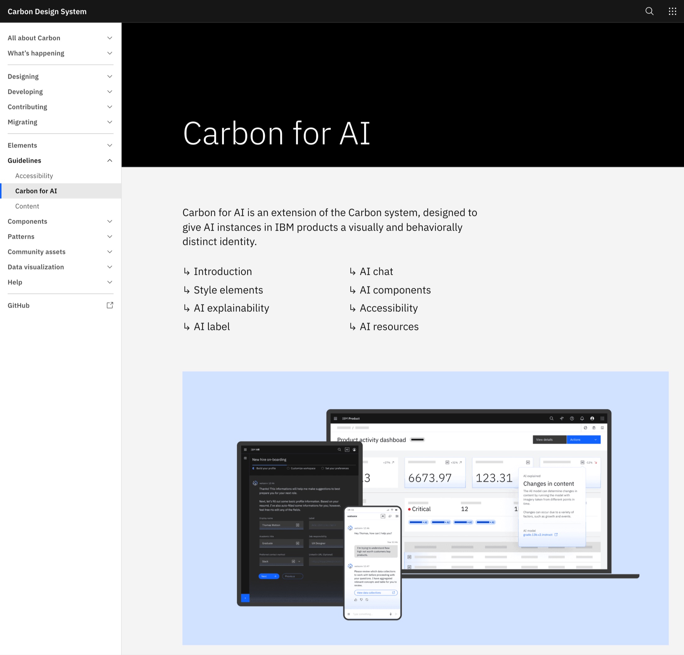
The recognition arrived in 2025: a Red Dot in Brands & Communication Design, an iF Design Award, and an AI Excellence Award. Nice to have. What matters more is that other people started treating the work as something worth copying.
The system showed that transparency didn’t have to live upstream in an ethics deck or downstream in legal copy. It could live exactly where users encounter the AI: in the component, with a version number and a release cadence. Regulation is catching up. The EU AI Act now makes transparency around certain AI interactions a legal requirement. We had already shipped the idea as parts.
AI transparency stopped being guidance teams had to interpret and became behavior their software inherited.
What still matters
The question keeps changing shape. What does AI look like? was the 2023 version. By the fall of 2024 I was guiding a working group with Chris Noessel on the next one: what does AI look like while it’s doing something on your behalf?
An agent needs to show you its plan before it acts, what happened after, and a way to stop it in between. Those patterns, agentic plans and workspaces, are in Carbon now, and agent-native products are being built on them.
I’ve spent the last decade working on how humans and AI meet, and the deliverable has never changed once. It was never the glow. It’s whether the person on the other side of the glass can trust what they’re looking at.